
As the Zenith Bank team expanded, ensuring a uniform style and visual coherence across all facets of the product became increasingly crucial. With a diverse range of over a dozen products, it became evident that adopting more systematic approaches was necessary to effectively guide and optimize our collaborative endeavors. The initial result was the establishment of a set of reusable components, governed by well-defined standards, facilitating the rapid construction of a variety of cohesive experiences.
Lead Product Designer | Zenith Bank
Research, Information Architecture, Interaction, Visual design and testing. Team of 2 designers and 10+ developers. Aug 2023 - Dec 2023
Upon examining Jira and engaging in one-on-one stakeholder interviews, it was apparent that Zenith Bank needed a new design language to ensure platform consistency, intuitiveness, and overall user delight. Notably:
44% of support tickets on Jira were found to be UI-related, underscoring issues related to inconsistent user experience.
20% of clients expressed dissatisfaction, citing concerns that the platform was overloaded with information and appeared outdated.
Business Goal: The primary objectives are to:
Reduce user support tickets.
Decrease training costs.
Getting everyone onboard:
Developing a Design System is a team effort; success requires the participation of everyone. The more comprehensive the integration, the more diverse skills are needed.
Planning & Priority:
Failing to plan is planning to fail. We constantly toggle between working on our design system and enhancing the application, and planning and prioritizing our tasks is imperative.
Breaking this news to clients:
Despite our clients expressing a longstanding desire for change, it was crucial to keep them engaged and enthusiastic about the significant upcoming changes. Initially, the project focused on our key partner clients.
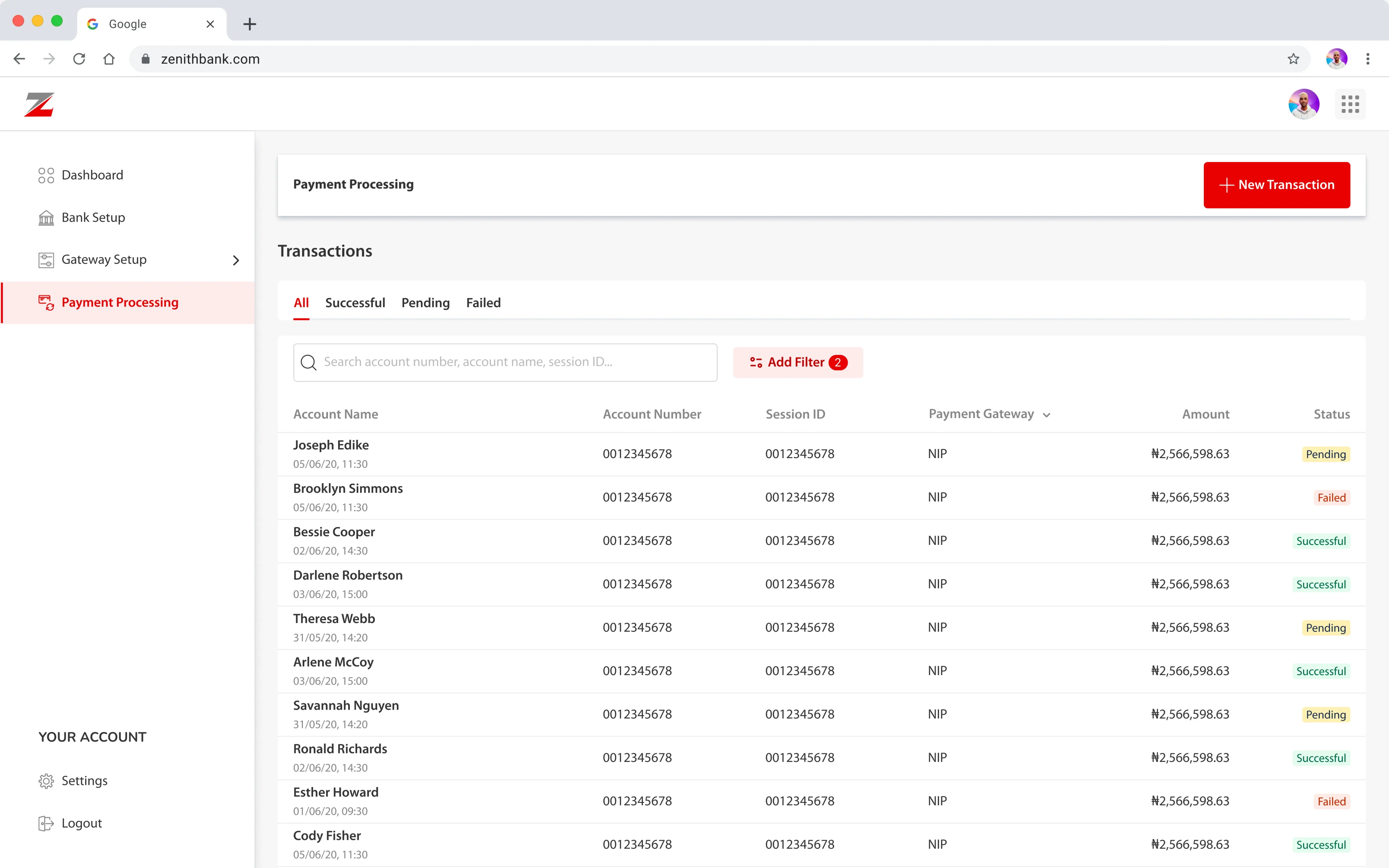
Fig: An application from Zenith Bank adopts the Zenith Style v1.0 design system.
This system is based largely on the principles of atomic design. The key idea behind this methodology being small, independent atomic - parts, can be combined into larger molecular structures.
This foundation loosely defined our typography, colors, icons, spacing, navigation, and information architecture. and proved essential for guiding our work in a unified direction. Reviewing our collective work at the end of each day, we began to see patterns emerge.
We course-corrected when necessary, and started defining our standardized components.
I use the 8pt grid system to space out the elements on a page. This means that any defined height or width, margin or padding will be an increment of 8
Our primary palette is comprised of neutrals, white, and reds. I am also committed to complying with AA standard contrast ratios
Primary
Pale Pink
#FDECEC
Pastel Pink
#FBDADA
Soft Pink
#F6A2A2
Scarlet Red
#E70000
Dark Red
#C00000
Burgundy
#4D0000
Neutrals
Light Gray
#F7F7F7
Silver
#EDEDED
Gainsboro
#DBDBDB
Light Slate Gray
#BBBBBB
Gray
#868786
Very Dark Gray
#333333
Jet Black
#111111
Supporting Colours
Pale Yellow
#FFF0B3
Dark Orange
#FF8B00
Light Salmon Pink
#FFEBE6
Reddish Brown
#BF2600
Mint Green
#E3FCEF
Hunter Green
#006644
In crafting our project's visual identity, the strategic use of Roboto as the base font, paired with Myriad Pro as the main font, resulted in a unified visual language that enhances consistency and user experience.
Heading H2
24px
Bold
Jet Black
Sub-Heading
18px
Bold
Jet Black
Body Text B1
16px
Regular
Very Dark Grey
Meta Content B2
14px
Regular
Gray
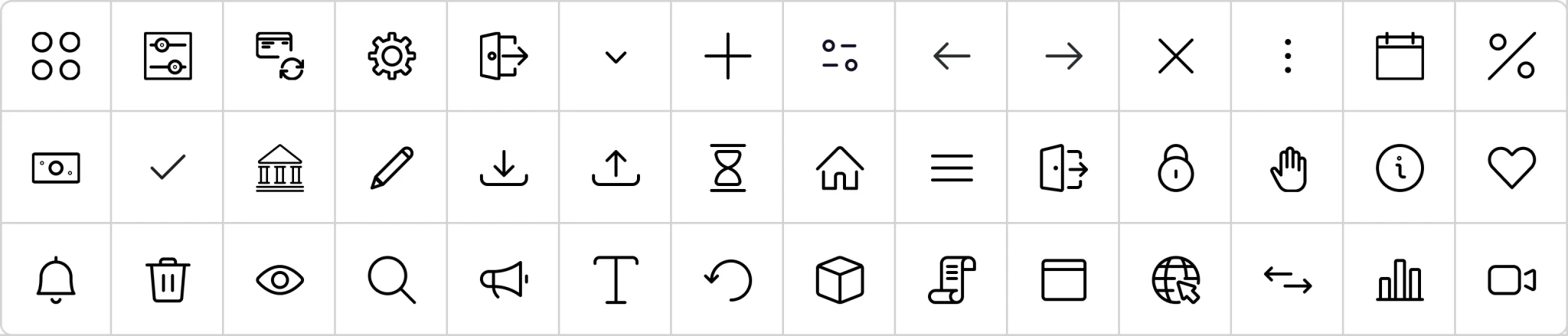
In the design system, I incorporated icons from the "Streamline Icons" pack, a choice driven by its adherence to the Golden Ratio principle. These thoughtfully selected icons not only added visual appeal but also contributed to a harmonious and balanced aesthetic within the design system, aligning with the principles of proportionality and visual balance.
In the design system, buttons were carefully crafted for a seamless and aesthetically pleasing user experience, ensuring clarity, consistency, and responsiveness.
Primary
Utilize it for the key action essential to fulfill the user's task.
Save
Secondary
Employ it for actions that hold lesser significance compared to the primary action.
Draft
Link
Apply this style when dealing with actions that trigger the opening of new pages, such as links, modals, or pop-ups.
Upload
Icon - text
Use this style when there are more than 3 actions at a time
Like
Disabled
Visually indicates that a particular action is unavailable or inappropriate at the moment, serving as a cue to users.
Disabled
Loading button
A loading button indicates that a process is ongoing, prompting user patience and restricting additional interactions during the loading period.

The form elements in our design system prioritize intuitive interactions, enhancing the user experience across Zenith Bank's software applications.
Field label
Placeholder
Disabled Field
Placeholder
Field Error
Placeholder
This field is required.
Field Success
Placeholder
Field validation is successful.
Selected Field
Jibril Abdulkadir @jeebzign
Filled Disabled
Jibril Abdulkadir @jeebzign
Focused Field
Jibril Abdulk

Robert Fox
@robert

Jibril Abdulkadir
@jeebzign

Annette Black
@annette_

Cameron Williamson
@cameron

Darlene Robertson
@darlene_robertson

Jacob Jones
@jacob
Multi-select-Field
Portland Headquarters
UK12
Lorem Ipsum
Checkbox
Normal
Checked
Checked - Disabled
Radio Button
Normal
Checked
Checked - Disabled
Tabs
Tab item 1
Tab item 2
Tab item 3
Tab item 4
Tooltip’s for extra help :)
Pagination
1
2
3
4
5
10
And many more…😅
During the component creation phase, we aggregated them into a master file, serving as our reference throughout the design process. Within a week or two, we observed significant boosts in productivity as the design library facilitated efficient iterations. During a critical moment, our team swiftly assembled nearly 30 screens for a last-minute prototype within a few hours, leveraging the framework provided by our library.
As the library expanded, we began structuring individual components into artboards based on similarity. These artboards were further categorized into Navigation, Marquees, Content, Image, and Speciality. Looking ahead, we envisioned developing an internal website to document the system, catering to both developers and designers.
168 × 168
A tool for representing and exchanging requirements information in a standardised format.
Read Case Study